Design an NGO website from scratch from researching to low and high fidelity wireframing, prototyping, testing to end product
Project Background
I was mandated to redesign this NGO website of a small budget, The NGO website will be use to communicate and showcase their project, register new members and attract donors for their couse
My Roles
UX: Research, Interviews & Testing , UI Design: Low and high fidelity prototype and Full Web development with WordPress
DISCOVERY
Research Goals
Determine what features people want in an NGO website
Get a feel of what people wishes when they visit an NGO website
Find out what motivates people to donate for a cause
Determine what will motivate people to stick on their project
Interviews & Participants
4 Female. Age 25, 46, 50, 58
4 Men. Age 32, 40, 55, 62
All of the participants are full time employed and are from different nationalities and the participants have at list one time donated to a non profit organizations NGO.
Summary
Those interviewed said they would donate to an NGO if their project is inline with their ideology.
Quality of NGO’s informations was of high importance.
People like to donate to NGO’s when they feel the need of the projects.
DEFINE
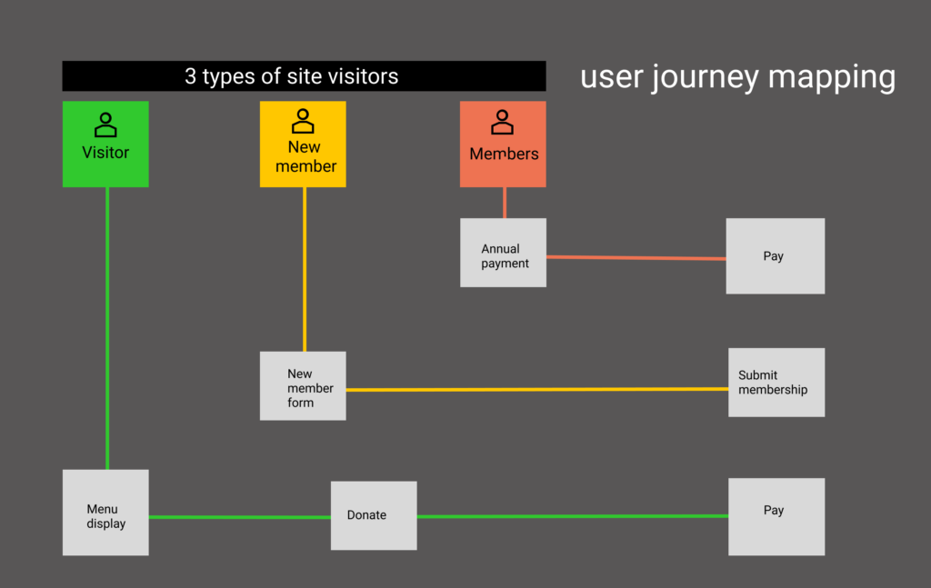
Journey mapping
Journey Maps are a UX visualization document that showcases the steps that a user takes in a process to accomplish a goal. As a result of these activities, I can identify the most important functionality an audience needs
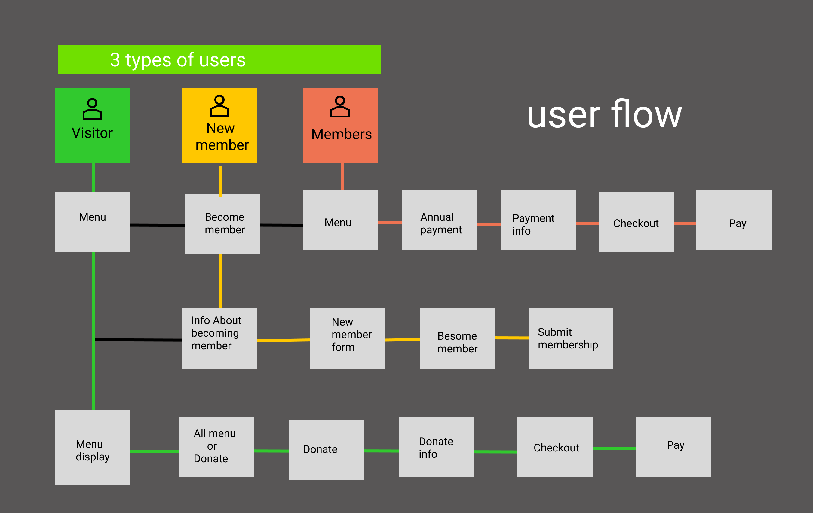
User Flow
A user flow is a chart or diagram showing the path a user will take in an application to complete a task. Therefor i build a user flows to intuitive design products, present the correct information to users at the right time, and allow users to complete desired tasks in as few steps as possible.
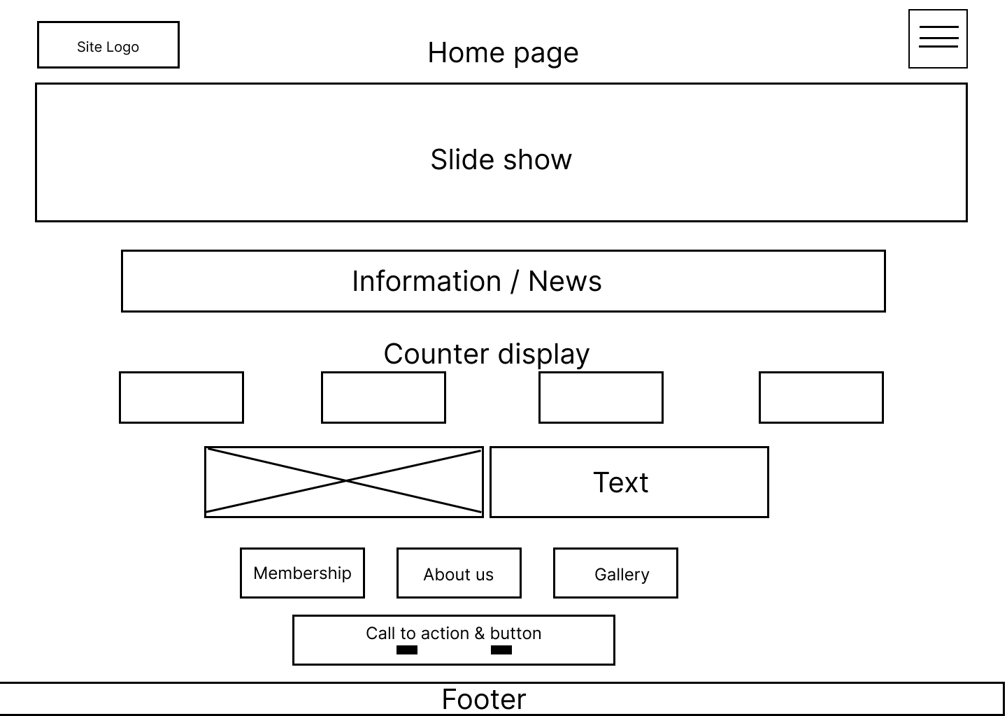
Sketches Wireframes
Building from all of the research I did and the personal development and journey mapping, I created low-fidelity wireframe within Figma in order to bring the user flow to life and determine the website information architecture.
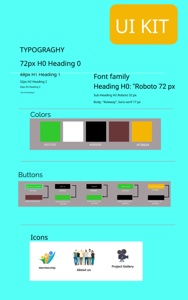
UI Kit
The UI kit, a comprehensive inventory of all of the design elements used for consistency when building the app, successfully
The UI kit, a comprehensive inventory of all of the design elements used for consistency when building the app, successfully
Design
I wanted the the website to be very simple and easy and fun to use. The logo, some icons, colors palette, typography where chosen by the stakeholder. The color palette originated from their country of origine. Designing good and powerful website with wordpress demandes some powerful plugins and most are not free, because of the low budget of this new NGO and the support i offered to them,
CHALLENGES
The NGO is a new organization and are still looking for funds, therefor the budget is very low. I only use free plugins that have limited feature to achieve this website. Example: Elementor, paypal payment plugin, Elementor kits, Counter number plugin
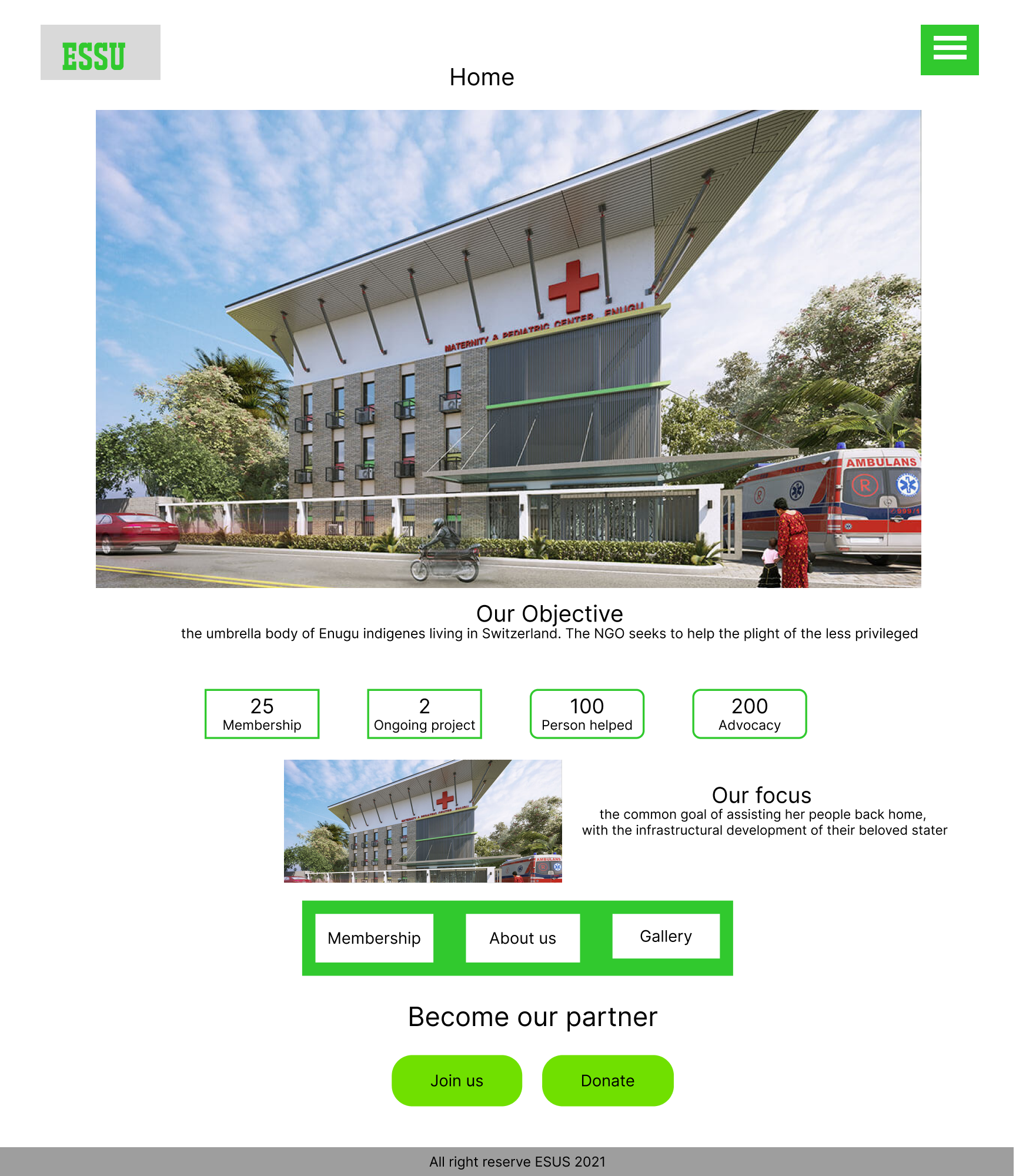
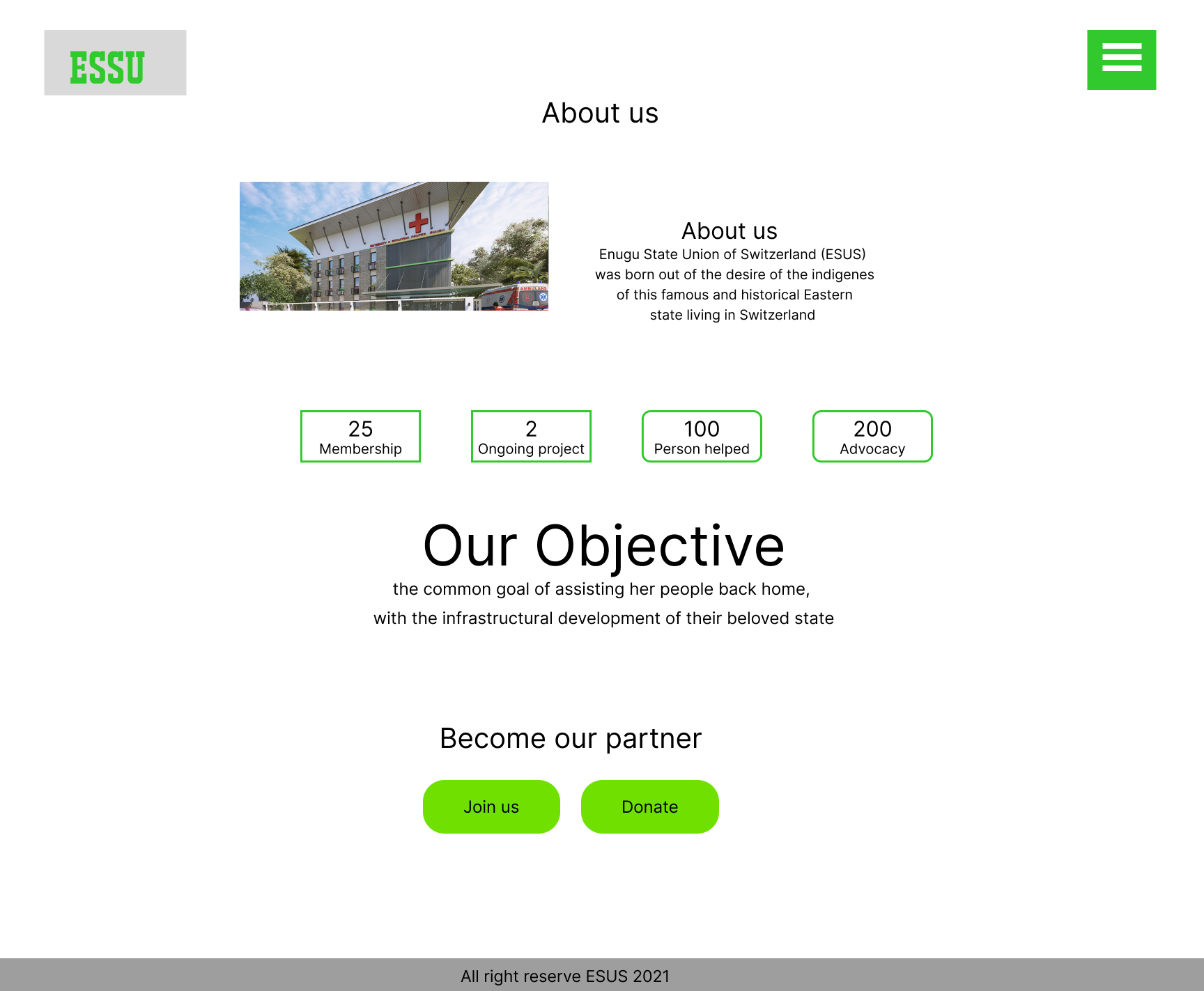
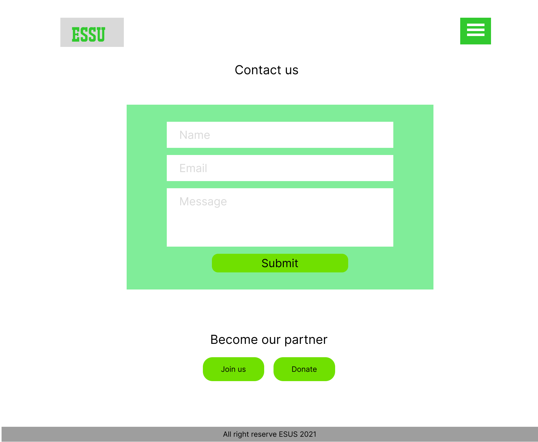
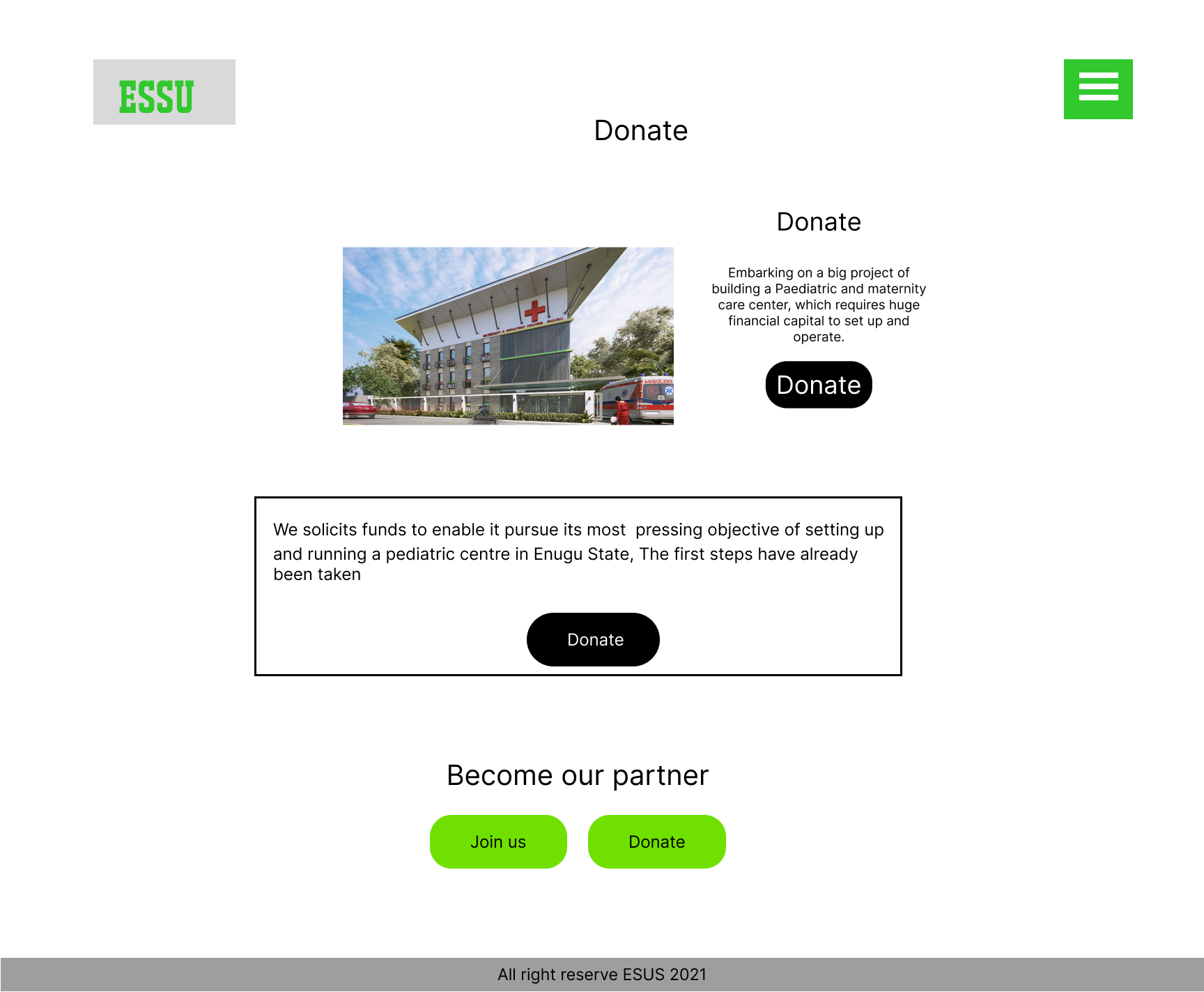
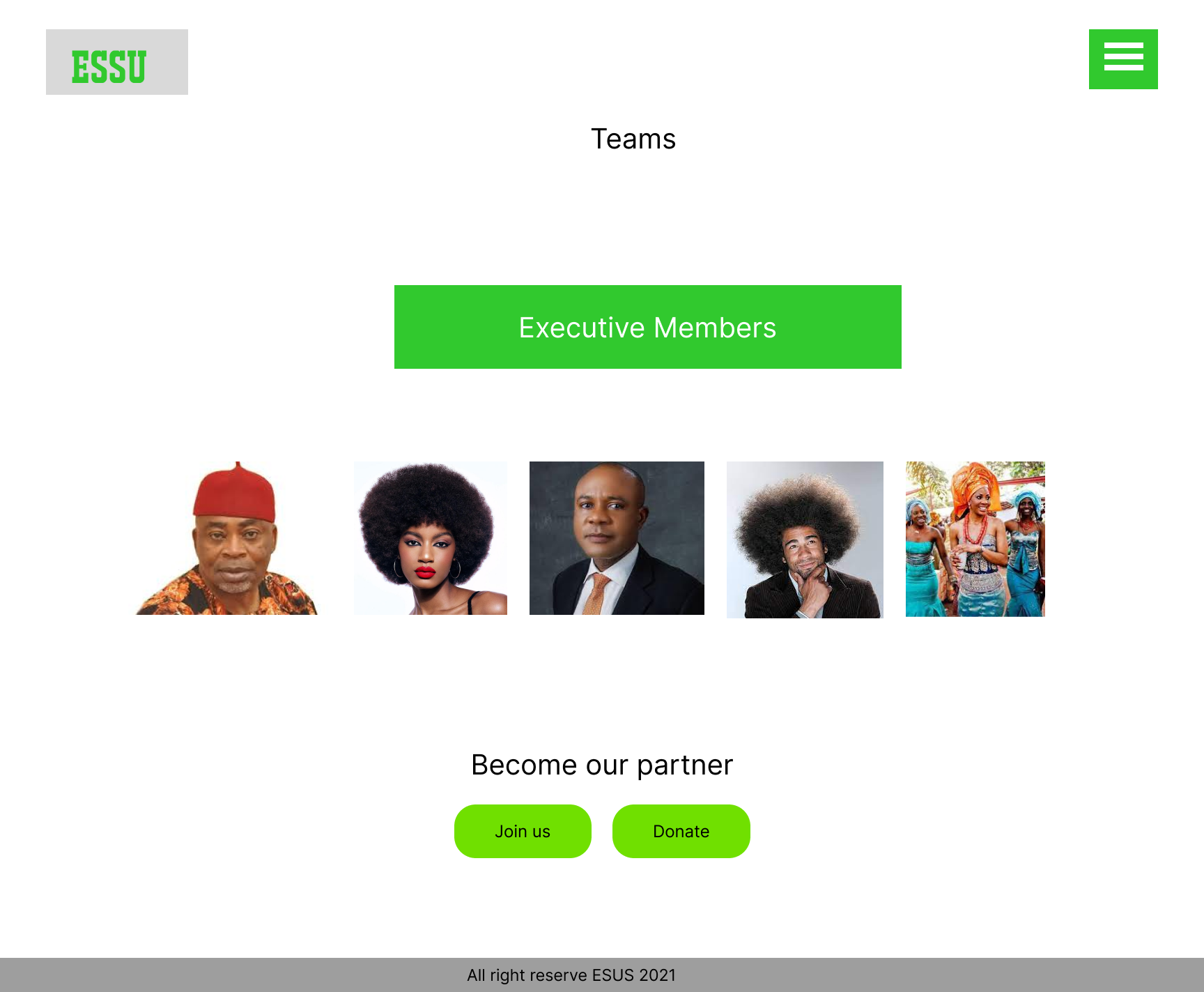
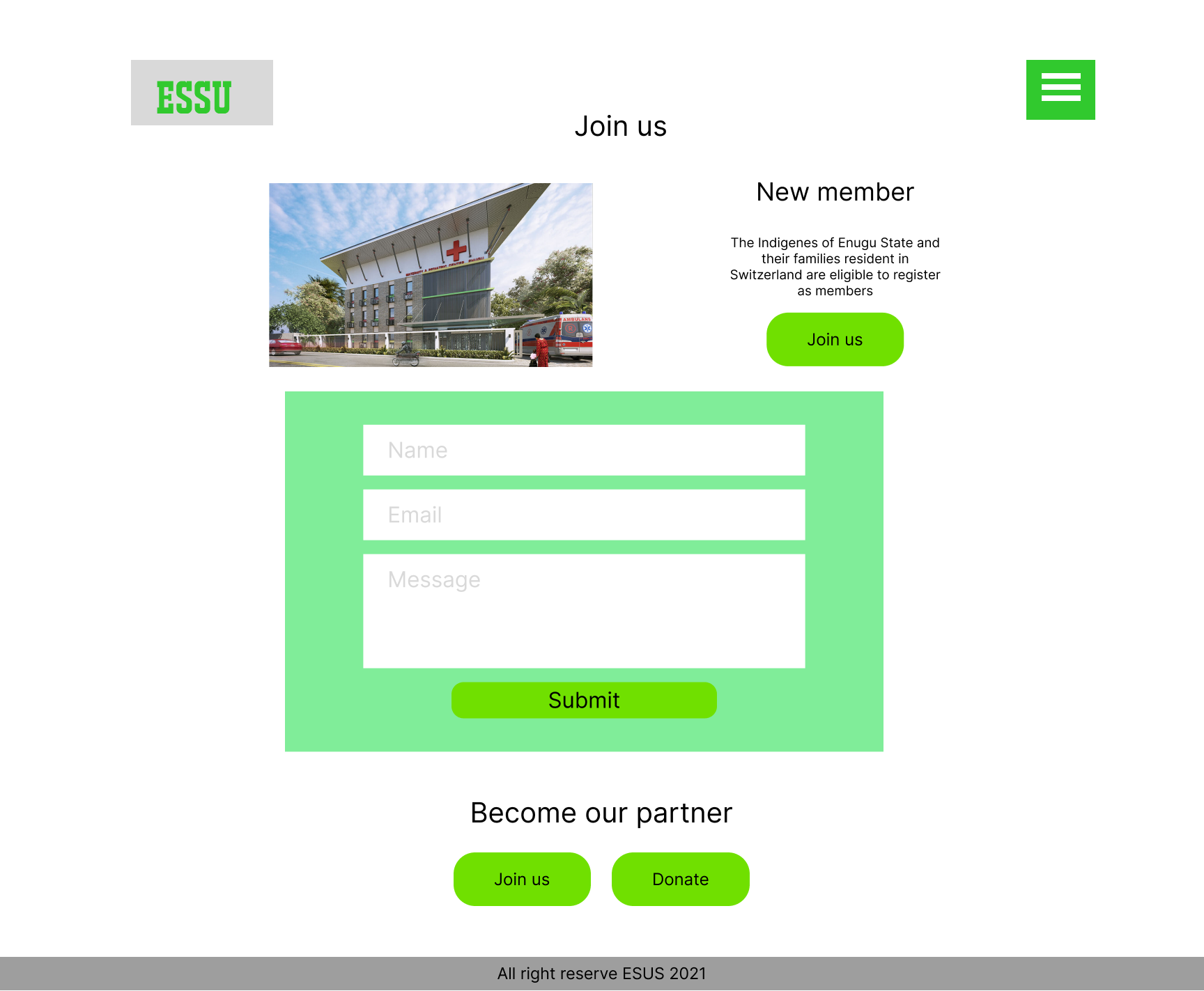
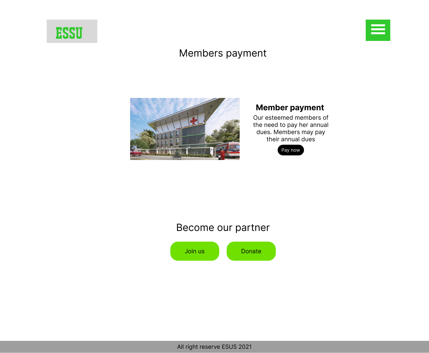
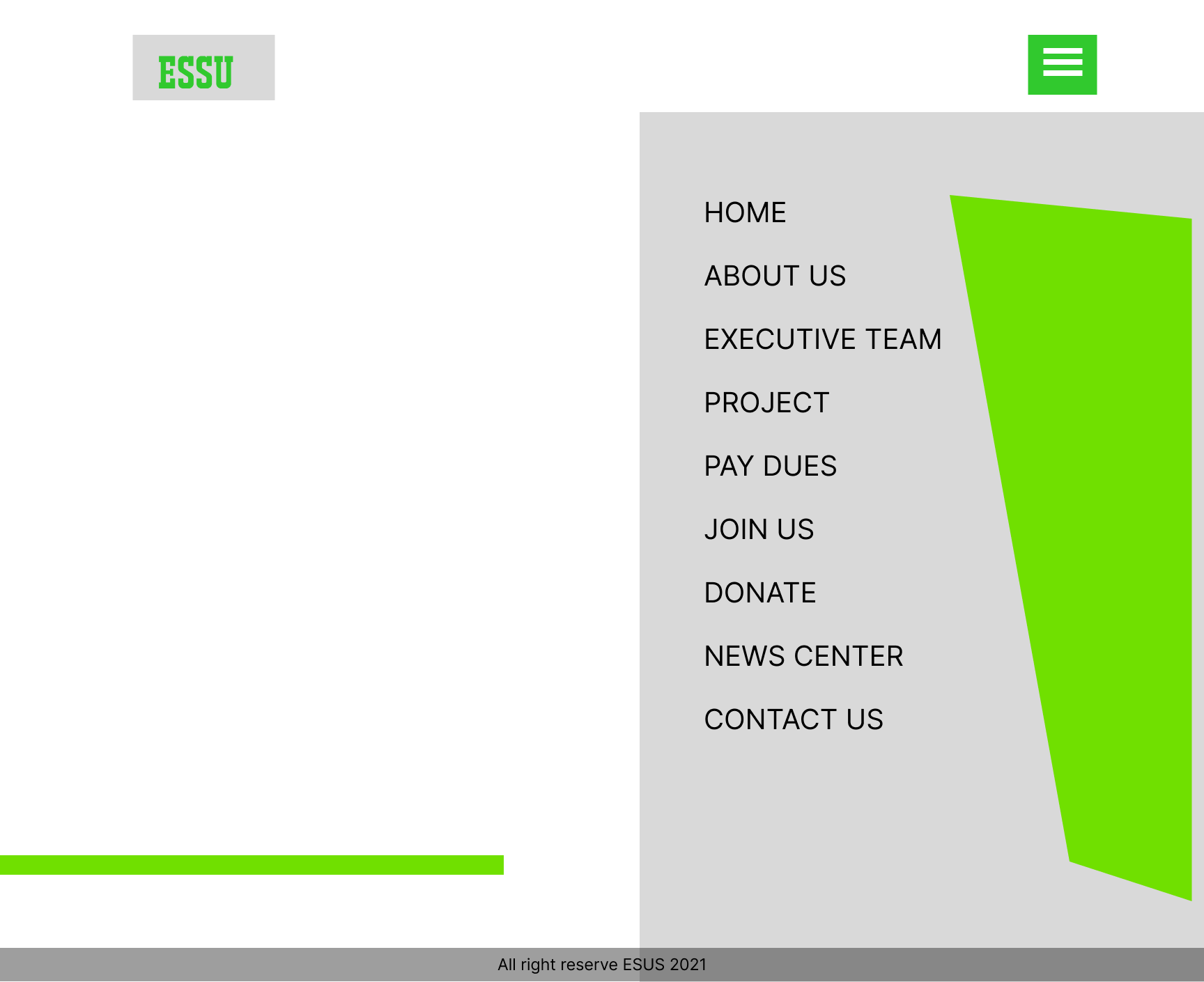
High Fidelity Prototype
After getting the branding to where I wanted it, I used my new look and feel along with my low fi mockups to put together the high fidelity mockups you see here. These are just a few sample screens.
Usability Testing
Participants
42 total test subjects – 4 in person (2 female, 2 male) – 1 remote (female) – 37 remote, unmoderated
Test Objectives
Determine the ease at which users can navigate through the app to accomplish their task, which will be to build and purchase meals.
Observe the path in which they took to get through to the payment screen
Test the overall ease of use of navigating through building their meals.
Observe any frustrations or obstacles users may have that may impede their ability to complete their task.
Test Summary
In Person/Remote Testing – Users completed the task in under 4 minutes.
– Confusion over some verbiage/terms.
– High marks for ease of use.
Unmoderated Remote Testing – 0% had direct success. – 51% used an alternate route – 49% gave up – Many expressed frustration or difficulty interacting with the prototype.
Test the overall ease of use of navigating through building their meals.
Observe any frustrations or obstacles users may have that may impede their ability to complete their task.